Google Unveils New Logo With Flat Letters and a Redesigned Navigation Bar
Posted by AZEEM ULLAH

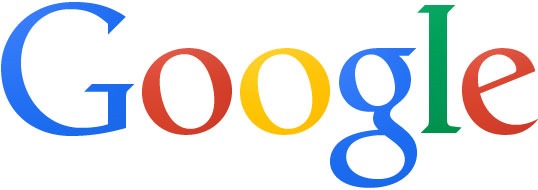
Google’s revolutionary search engine recently went through a major redesign. The letters of the logo in the search engine homepage are now completely flat instead of an embossed look which started to look a bit archaic.
The colors, of course, haven’t changed.
The design also now appears to be consistent with Google’s recent design language and inspiration.
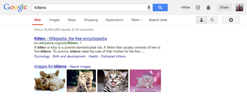
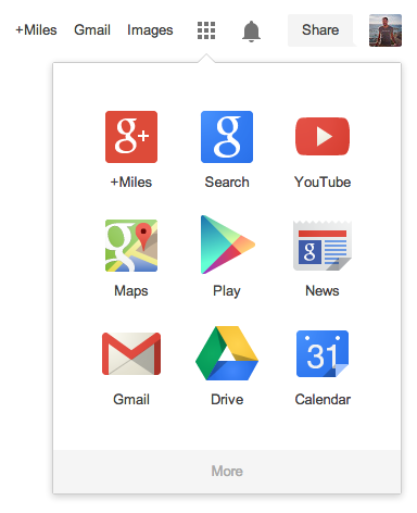
The navigation bar also saw a major change. Now, instead of appearing in a black line at the top, the options of will now appear under an app drawer icon alongside the search bar.
“As part of this design, we’ve also refined the color palette and letter shapes of the Google logo,” the official statement on Google’s blog said.
“We’ll be rolling out this update across most Google products over the next few weeks, so keep an eye out and let us know your thoughts.”
The changes will be permanently implemented in the coming few weeks.


The post Google Unveils New Logo With Flat Letters and a Redesigned Navigation Bar appeared first on .


