

AirVisual Earth: This Map Shows Real Time Air Pollution in 3D
Posted by AMBREEN SHABBIR
According to the World Health Organization (WHO), around 7 million death, across the globe, in 2012 were caused by air pollution. Since then, the pollution has increased manifold.
The problem with air pollution is that it cannot be visualized unless it is extreme. Even when you are able to see the distinct smog or the hazy view outside your window, it is easy to blame some other country whose industrialization is causing you trouble.
To visualize the movement of these pollutants and the nasty air that you are breathing in, a Pekin-based company has made a 3D map of air pollution.
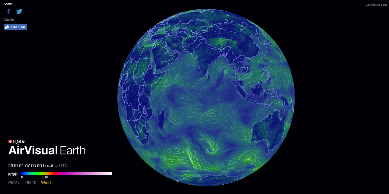
This map shows the interaction of ambient particulate matter (PM 2.5) levels and the weather patterns in real time. It incorporates data and animated infography to communicate the air quality at the time. It is easily comprehensible for the layman as well.
Notably, the data owes it to three different sources, i.e., government data, special captors by the company, and the satellite images. The map is based on data taken from 10,000 monitoring stations and crowdsourced data from AirVisual’s own monitors.
How to Use it
The map displays an air quality index (AQI) on a scale of 0 to 300+. The higher the score is, worst is the air quality of that region. It takes into account 8000 key cities in over 60 different countries.
Once you open the map, there will be an AQI (Air Quality Index) levels across the Earth through color-coded heat mapping.

Click on the map and a particular location will appear on the map. It takes into account certain cities, so you can see the details of those only. You can see the PM2.5 levels for the marked area.

You can zoom in and out of a marked location. In order to check a specific location, spin the globe by clicking and dragging the cursor. You will be able to see different location marks naming a certain city.
You can also switch between the combined weather data and PM 2.5 levels. Tap on ‘PM 2.5’ on the bottom left. The flow and movements of PM 2.5 across the planet will appear.
You can also see the wind patterns by toggling to the ‘wind’ option in the bottom left.
You can check this map here.
The post AirVisual Earth: This Map Shows Real Time Air Pollution in 3D appeared first on .


