

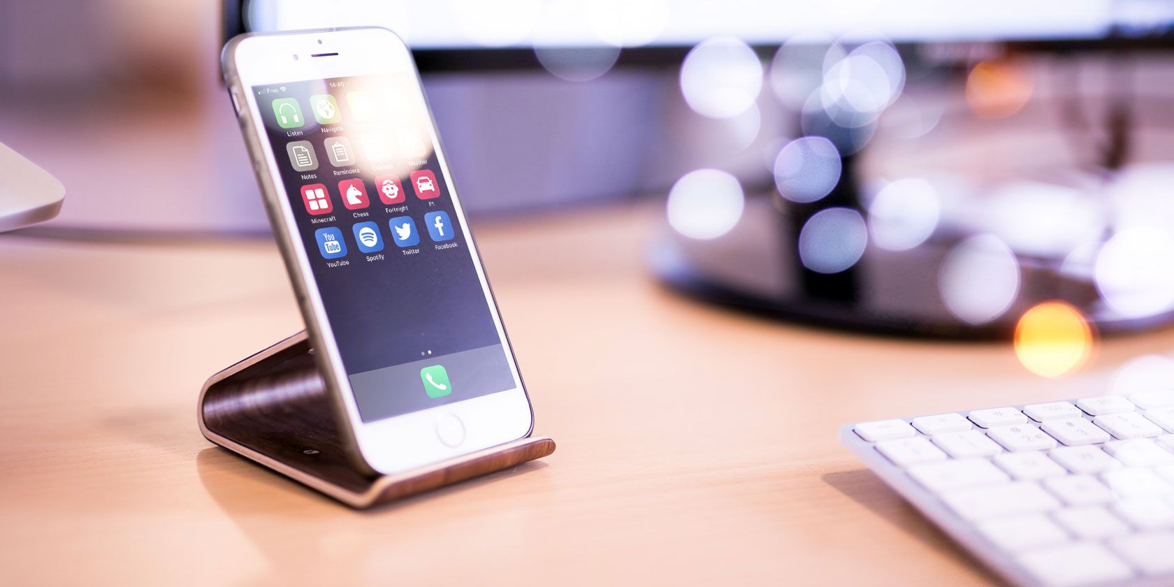
12 Creative Layouts to Organize Your iPhone Home Screen
Posted by HAMISH DOWELL
It’s fun to re-arrange your home screen from time to time. Categorizing app icons by folder or page is a handy way to keep a growing app collection under control, but there are more creative ways to switch it up.
Here are some compelling alternative layouts ideas for your iPhone or iPad’s home screen.
First, Custom Icons in the Shortcuts App
Many of these layouts call for custom icons. To create these, you’ll need to use the new Shortcuts app built for iOS 12. It allows you to create custom bundles of commands for greater productivity.
For our purposes, it’s easy to create a custom icon. Download and launch Shortcuts from the App Store, then tap Create Shortcut to make a new one. Search for Open App, then choose the app you want to create a custom icon for.
Next, tap the Settings icon in the top-right (it looks like two sliders). Tap the Icon field and you can choose the Color and Glyph you’d like. If you’d rather, you can also take a new photo or select an existing one on the Home Screen tab to use for the icon.
When you’re done, tap the Share button and choose Add to Home Screen to finalize the shortcut.

You can get creative as you’d like. But to keep it simple, we’ll use basic colors and symbols to represent apps.
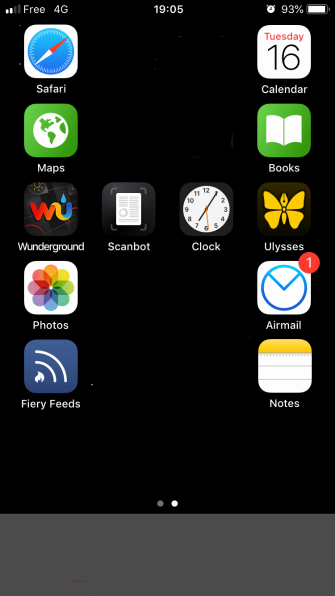
1. The Minimalist
For this layout, put everything into a single folder and center it on the dock. To keep it really neat, move all the apps except one out of the first page of the folder.
Rather than hunt through a packed folder to find the app you want, you can get to it quickly with Siri search. Swipe down on the home screen, type the first letter or two of the app you’re after, and pick it from the search results. Over time, Siri will try to predict which app you want and suggest it without you having to type anything.
Who it’s great for: Anyone who hates clutter. People who love looking at their iPhone’s wallpaper more than looking at app icons. It’s also great for extending battery life on OLED iPhones when combined with a plain black background, because fewer pixels are lit up.
2. Monochrome
Use the Shortcuts app to recreate monochrome icons for your most-used apps. Some system apps like Settings and the Camera already have grayscale icons, so you don’t need to worry about those.
Who it’s great for: People who like everything neat and tidy but aren’t ready to go full-on minimalist. Also handy for people suffering from some types of color-blindness.
3. The Rainbow
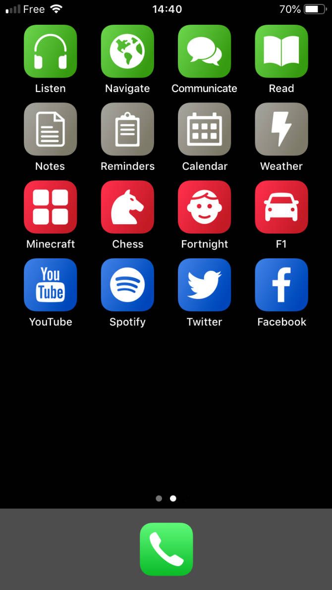
Speaking of recreating app icons, another alternative is to replace your icons with color-coded Shortcuts. Why not make all your work apps green, your games red, and all entertainment apps blue, for example?
Who it’s great for: Anyone who wants to bring order to the chaos of overly ornate app icon designs.
4. The Menu
Instead of grouping apps by folder, create Shortcuts with list menus to choose which app you want to open. Name the shortcuts by the activity they represent.
For example, have a shortcut called Read that offers a menu of reading apps (Kindle, Books, an RSS reader, and so on).

Who it’s great for: Those who like options but not clutter. Anyone who doesn’t like hunting through folders full of apps.
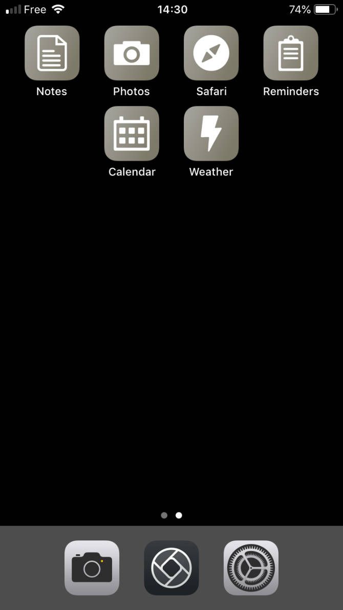
5. The Monogram
Thought you were stuck with the grid layout on your home screen? Think again! Create blank app icons with Shortcuts or Makeovr and use them to introduce space into your layout. It opens up a world of possibilities, including the option of making your name’s initial out of your apps.
Be sure to give your blank icons empty names too. iOS won’t let you use spaces as a name, but you can use an invisible Unicode character instead. Copy invisible Unicode characters to paste as blank names from the Unicode character table.
Who it’s great for: Anyone whose ego is bigger than their iPhone’s gargantuan amount of storage.
6. Dockless
If you’re the type who likes to keep everything on one screen instead of spread over multiple pages, the dock loses its importance. So why not get rid of it altogether? Although it’s not possible to remove it completely, you can hide your iPhone dock with a clever trick.
Who it’s great for: Single-screen warriors, or anyone who gets triggered by an unnecessary band at the bottom of their phone.
7. The Right-Hander (Or Left-Hander)
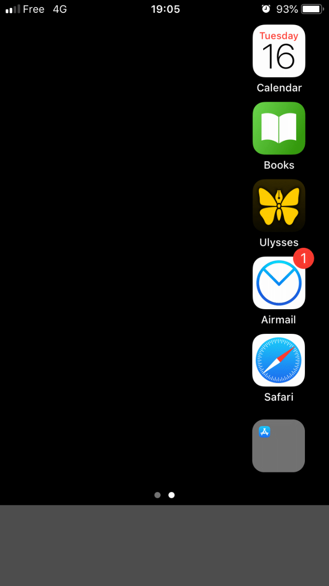
Big screens are awesome, but reaching for icons at the furthest sides of the display can literally be a pain. Instead of practicing digital yoga every time you want to open an app, why not keep your icons down one side?
Blank icons can fill the unused side of your screen, using a site like Makeovr.
Who it’s great for: People with small hands and big phones.
8. The Bottom Line
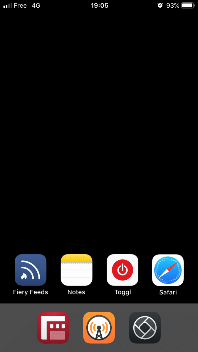
Apple knows that the bottom of the screen is prime real estate, since it’s the easiest part to reach. It’s why the dock is down there. Since the iPhone X, revamped home screen gesture means your fingers and thumbs spend more time in the lower quadrant.
Thus, it makes sense to ignore the top of the home screen altogether and drop your app icons along the bottom, Tetris-style. Use blank icons to push everything south.
Who it’s great for: iPhone X/XS/XR owners whose fingers spend more time swiping around the bottom area already.
9. The Noticeboard
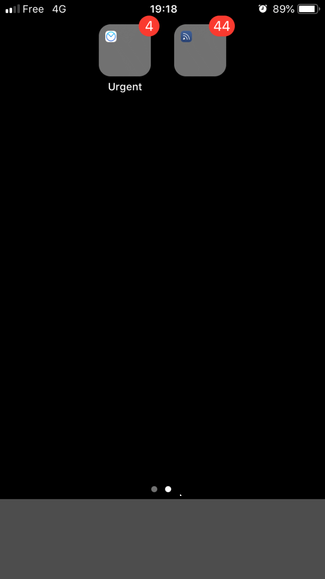
Notifications: we can’t live with them, but can’t live without them. There’s no doubt that how you manage iPhone notifications plays an important part in the look of your home screen, but are they all equally important?
Why not group apps that display badges into urgent and non-urgent folders? That way you can see at a glance how many of those little red badges really need your immediate attention.
Who it’s great for: Anyone who can’t rest as long as there are red and white numbers plastered across their home screen.
10. Work/Play
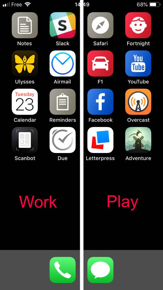
Keep work-related apps on one page, and entertainment apps on another that you only look at outside of working hours.
Combine this with iOS 12’s Downtime feature to disable everything on the work screen automatically at 5pm. Or if you need to be more productive, have Downtime disable everything on the play screen during working hours,
Who it’s great for: Anyone who gets easily distracted. Workaholics who need to force themselves to take a break.
11. Incognito
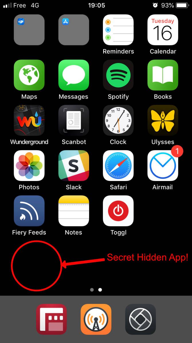
Got something on your phone that you don’t want anyone to know about? Perhaps an app you’d like to hide? Use Shortcuts or Makeovr to create an invisible icon for it, and name it with an invisible Unicode character.
Keep at least one empty row per home screen page, and nobody will ever know that you’ve got something top-secret stashed there.
Who it’s great for: Spies, and anyone else who likes to keep a secret.
12. The Librarian
Can’t decide how to organize your apps? Unable to choose between sorting icons by style or classifying them by color? Take the librarian’s option and arrange your apps in alphabetical order.
Never again will you have to agonize over where to put that newly downloaded utility or game. Simply slot it into place according to its name.
Who it’s great for: People with ordered minds.
Think Outside the Box for Your iPhone Layout
Despite the restrictions that Apple puts on the iPhone home screen, with a little out-of-the-box thinking and some simple tricks, you can come up with all sorts of alternative layouts. If you’ve got any of your own, why not share them in the comments below?
Need more help to get your home screen sorted? Then be sure to check out tips to declutter your iPhone.
Read the full article: 12 Creative Layouts to Organize Your iPhone Home Screen


